This is the first test i have done i got some vector images and started to mess around with colours and how i will get the outline for my final image i am happy with these as it is just the beginning for vector images
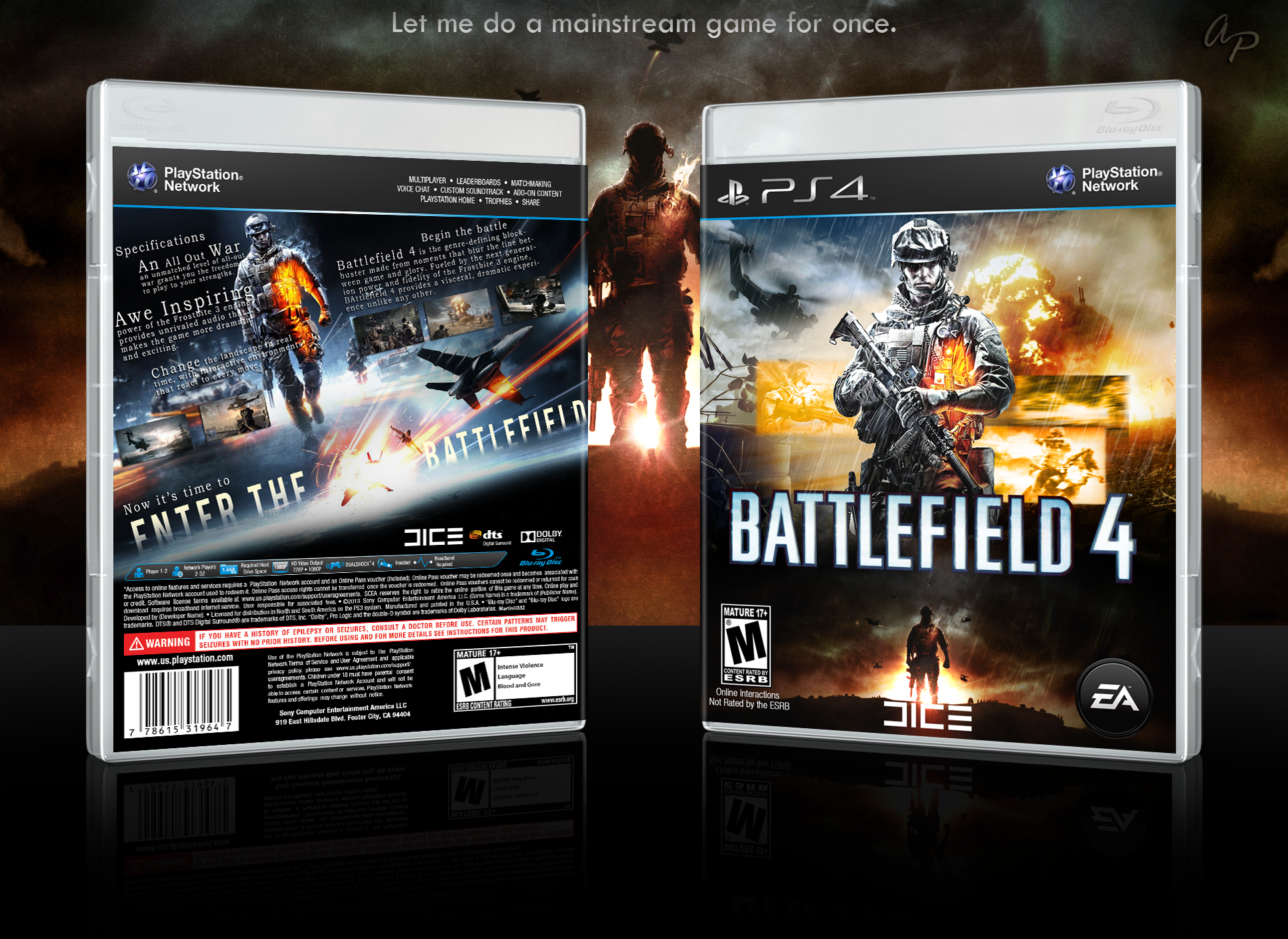
This is a game cover for a first person shooter. The games is Battelfield 4.
Section 1
on this game cover there are 4 things we look at Contrast, Repetition, Alignment and Proximity. or known as C.R.A.P.
firstly the contrast this is when two or more thing clash to give it a contrast and make it stand out. so the white text on the front saying battlefield to the black background, or the orange contrasting with the black and white. other things that contrast are the two images on the front as one is big and bold the other is more discrete but still both stand out due to each other. on the back of the cover the white text again contrasting with the black dark background but on the back it has a white streak to make it have a contrasting and eye catching look.
Secondly is the repetition on this game cover the only thing I see repeated is the same character repeated three times twice on the front and once on the back. but these are all slightly different as they are in different backgrounds and different positions but they are all the same character
Thirdly the Alignment this is when text images and logos line up on this the front cover has only a few alignments the first is the two solders both in the centre also not so clear the main title lines up with the information on the back so the bottom of the text is the top of the legal information. on the back of this cover there is a few more as the critic reviews and the reviews these are on an angle at the same degrees. and are on the same line. the other things are the legal information copyright and game info are all lined up with the barcode. this makes it have a clean and professional look to it.
Final the proximity this is where items are collected together so on the back all the reviews are put together and all the legal information with copyrights are also put together. this creates a more professional look and keeps every thing tidy and clean.
Section 2
In this cover it's not very busy in text but it has a lot of images. The hierarchy on this game cover is the main character then the text as it stands out more then the title. On this cover it also has a range of other things like iconography as the image of the that solider is a very well known image of all battlefield game, as of the solder coming out of the mist with a military rifle and with the look of anger and readiness to fight. Also the text is also iconography as it is the same text in battlefield 3 or very similar. The typography on this is a sans serif and it has a clean and cool design to go with it well known with battlefield. the title is also known as a display font as its bold simple but has a big punch. the game cover also includes the company that made it in this case Dice but with the publishers EA and also including other company's like blue ray and adobe sound this shows it is a high end game.