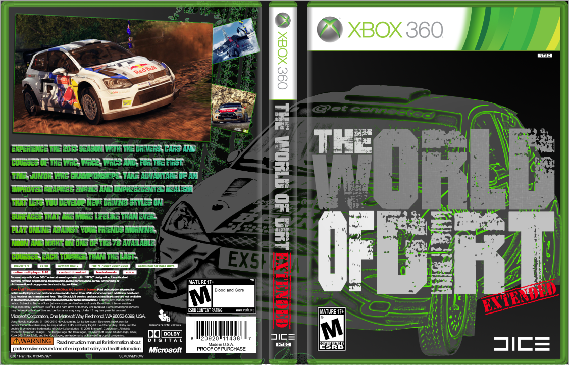
The Technics i have used are pen tool, layer mask, gradient, colour, size tool, magic wand and others i think. so firstly i got my main image and used the pen tool to cut it out of the image so i ended up with just the image, i than made the image into a gray, black and white image. than i took the image changed the contrast around than after all this i made it into a line drawing with technical with the fill in gradient setting to finally get the image it the way it needed to be before i duplicate it. after this i changed the image to have a green outline and tint this image was than layered mask to create a layer that was peeled away by using the gradient tool. the Main title "WORLD OF DIRT" was made out of many different text that i changed the colour than ratersize it to an image so than this means i could edit to the right size so i could create a block of text in different sizes this was really effective so i kept it but changed the colours make it stand out more from the background image, this made it have a big impact on the game cover. i used the same method of the main image on the text on the back cover and the background image behind the text and car.
I am very happy with the design i have created it its all the criteria that i have set my self in that it has the effect of professional game cover. with loads of effects and multiple levels for each image, to give it as smooth and professional look as possible. The design has changed a lot since the beginning of my work in the initial image and text layout. if i was going to change a few things it would be the main image i used to be more a famous car with a more graphic design and background with it. as this is letting my work down. The title i am very happy with as it worked better than i expected in that a it is covering a lot of my work and is in the center i thought it was going to be to outrages but in the end it worked our brilliantly, with the colours i have chosen. this bring me on to a new point in that my colour palet that i have chosen is very simple in design as i used white to black with the grays in between. i only used a few more colours the main colour that stands out is green, as i thought this will look good tin the end plus it was a mistake that ended up to work to my advantage. the only other colour that has a big impact is the red "EXTENDED" that really brings some life into the work. now i am going onto the text on the back in the multiple colours i did this as one colour of dark green was lost in the background image so i decided to put a mask on it in a more blue colour that helped it stand out from the background, so if i did change this i would keep the same colours but change the type of font to a sans serif with an impact look to it. now going to the background i only have one image which is of a tyre imprint this has had also a mask over t with a plastic shrink glossy look to it. this also has a green outline to make it stand out more clearly from the background. if i was gong to change any thing else it would be the amount of images in the background as i would put more types of tracks and a lot ore to fill it up to the brim making it a busy background to help the game stand out due to all the lines and crossing of green but this could be overdone and not look good so i will look into it. so for the final time this is my final piece. it will be some where on this post as Blogger likes messing up with things =)